Thread
You don't need to be a web designer to make a good landing page
You just need to know what psychological triggers will push your viewers to convert
Here's 5 Marketing Tactics you can't overlook 👀
//THREAD//
You just need to know what psychological triggers will push your viewers to convert
Here's 5 Marketing Tactics you can't overlook 👀
//THREAD//
Landing pages are likely one of the quickest methods to increase marketing ROI
What are they?
Landing pages are simple standalone web pages that encourage users to take action
The benefits:
∙They allow for easy testing
∙They're simple to create
∙Minimal/No upfront cost
What are they?
Landing pages are simple standalone web pages that encourage users to take action
The benefits:
∙They allow for easy testing
∙They're simple to create
∙Minimal/No upfront cost
ABOVE ALL one of the greatest advantages is the ability to quickly test new product ideas
There's no need to spend months/years into development if you can't gain initial interest
Use your LP to capture an audience & build anticipation pre-launch
If not back to square one..
There's no need to spend months/years into development if you can't gain initial interest
Use your LP to capture an audience & build anticipation pre-launch
If not back to square one..
You've decided to announce an awesome new product!
Now what?
First, what are your goals?
Generally the main goal is to to obtain email addresses
So depending on your product all you have to ask for is an email
Simple enough, right?
Ehm, not quite... let's dive into why
Now what?
First, what are your goals?
Generally the main goal is to to obtain email addresses
So depending on your product all you have to ask for is an email
Simple enough, right?
Ehm, not quite... let's dive into why
People are already bombarded so much online you have to stand out
You'll have to offer something of high value OR trigger an emotional response in exchange for most people's emails
Bonus points (& more sign-ups!) if you can achieve both
So let's get started with how
You'll have to offer something of high value OR trigger an emotional response in exchange for most people's emails
Bonus points (& more sign-ups!) if you can achieve both
So let's get started with how
1. Content needs to be emotional & problem-focused
The best copy:
∙ Injects emotion
∙ Creates anticipation/urgency
∙ Makes a guarantee
∙ Clear CTA
Headline ➔ stop the reader dead in their tracks
Line 2 ➔ give the "how"
Illustrate ➔ benefits > features + uniqueness
The best copy:
∙ Injects emotion
∙ Creates anticipation/urgency
∙ Makes a guarantee
∙ Clear CTA
Headline ➔ stop the reader dead in their tracks
Line 2 ➔ give the "how"
Illustrate ➔ benefits > features + uniqueness
2. The CTA is clear
A CTA is useless without action (hence the last "A")
CTA must-haves:
∙ Should be limited to ONE
∙ Easy to locate
∙ Stand-out (contrast)
∙ Consumer-centric ('exclusive, notify me when.., invite me,' etc)
∙ Close to sign-up field(s)
A CTA is useless without action (hence the last "A")
CTA must-haves:
∙ Should be limited to ONE
∙ Easy to locate
∙ Stand-out (contrast)
∙ Consumer-centric ('exclusive, notify me when.., invite me,' etc)
∙ Close to sign-up field(s)
3. Reduce friction
You want to make make it as easy as possible to sign-up
Rule #1 Don't ask for too much information
Including:
∙ Too many fields
∙ Sensitive info
Rule #2 Avoid friction words
∙See more by @jmoserr
You want to make make it as easy as possible to sign-up
Rule #1 Don't ask for too much information
Including:
∙ Too many fields
∙ Sensitive info
Rule #2 Avoid friction words
∙See more by @jmoserr
@jmoserr 4. Incentivize
Back to value - what can you offer your visitor as a fair trade for their email?
Some ideas:
∙ Exclusive content
∙ Free trial
∙ Beta access
∙ Waitlist
∙ Discount code
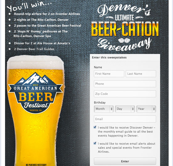
∙ Sweepstakes/Drawing
Just make sure it's relevant to your brand..
Back to value - what can you offer your visitor as a fair trade for their email?
Some ideas:
∙ Exclusive content
∙ Free trial
∙ Beta access
∙ Waitlist
∙ Discount code
∙ Sweepstakes/Drawing
Just make sure it's relevant to your brand..
@jmoserr 5. Designed for your audience
Answer - who's your audience?
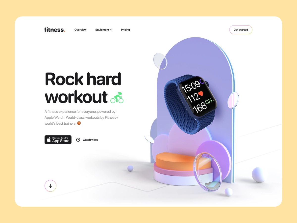
The attention of a business manager will be captured differently than that of a fitness aficionado
Think:
∙ Colors
∙ Layout
∙ Visuals
∙ Font type
∙ Word format
Answer - who's your audience?
The attention of a business manager will be captured differently than that of a fitness aficionado
Think:
∙ Colors
∙ Layout
∙ Visuals
∙ Font type
∙ Word format
@jmoserr Other tips to increase conversion:
∙ Reduce page load
∙ Perform regular A/B testing
∙ Social proof
∙ Social profiles
∙ Quality images
∙ Leverage data
∙ Videos are a plus
It may not make sense to utilize everything but you'll quickly find what works or not with testing
∙ Reduce page load
∙ Perform regular A/B testing
∙ Social proof
∙ Social profiles
∙ Quality images
∙ Leverage data
∙ Videos are a plus
It may not make sense to utilize everything but you'll quickly find what works or not with testing
@jmoserr Testing is key in the pre-launch phase 🧪
Build different campaigns & closely track results until you find a clear winner
There's no exact formula but the more you test the better results you'll get collecting top-of-funnel leads
& if it goes well prepare to launch 🚀
Build different campaigns & closely track results until you find a clear winner
There's no exact formula but the more you test the better results you'll get collecting top-of-funnel leads
& if it goes well prepare to launch 🚀
My name is TJ & I frequently post about building efficient sales processes
If you enjoyed this thread please RT the top Tweet & follow me @salesetup for more on:
∙ Sales psychology
∙ Automations
∙ Data
If you enjoyed this thread please RT the top Tweet & follow me @salesetup for more on:
∙ Sales psychology
∙ Automations
∙ Data
