Thread
Vera Molnár's piece "Sainte-Victoire en rond" is a masterclass in how small details can add up to make a work really beautiful. I spent the last week studying it as part of Recreating the Past @sfpc ‒ here's what I learned. (My recreation is at the end of the thread!) 

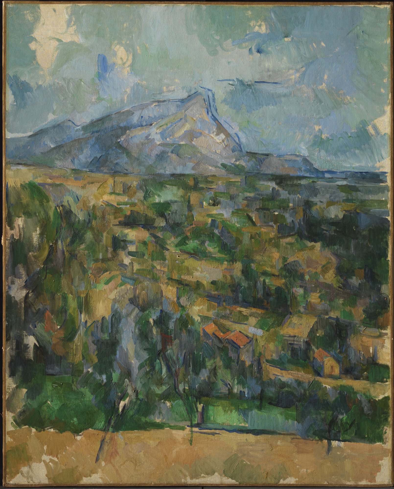
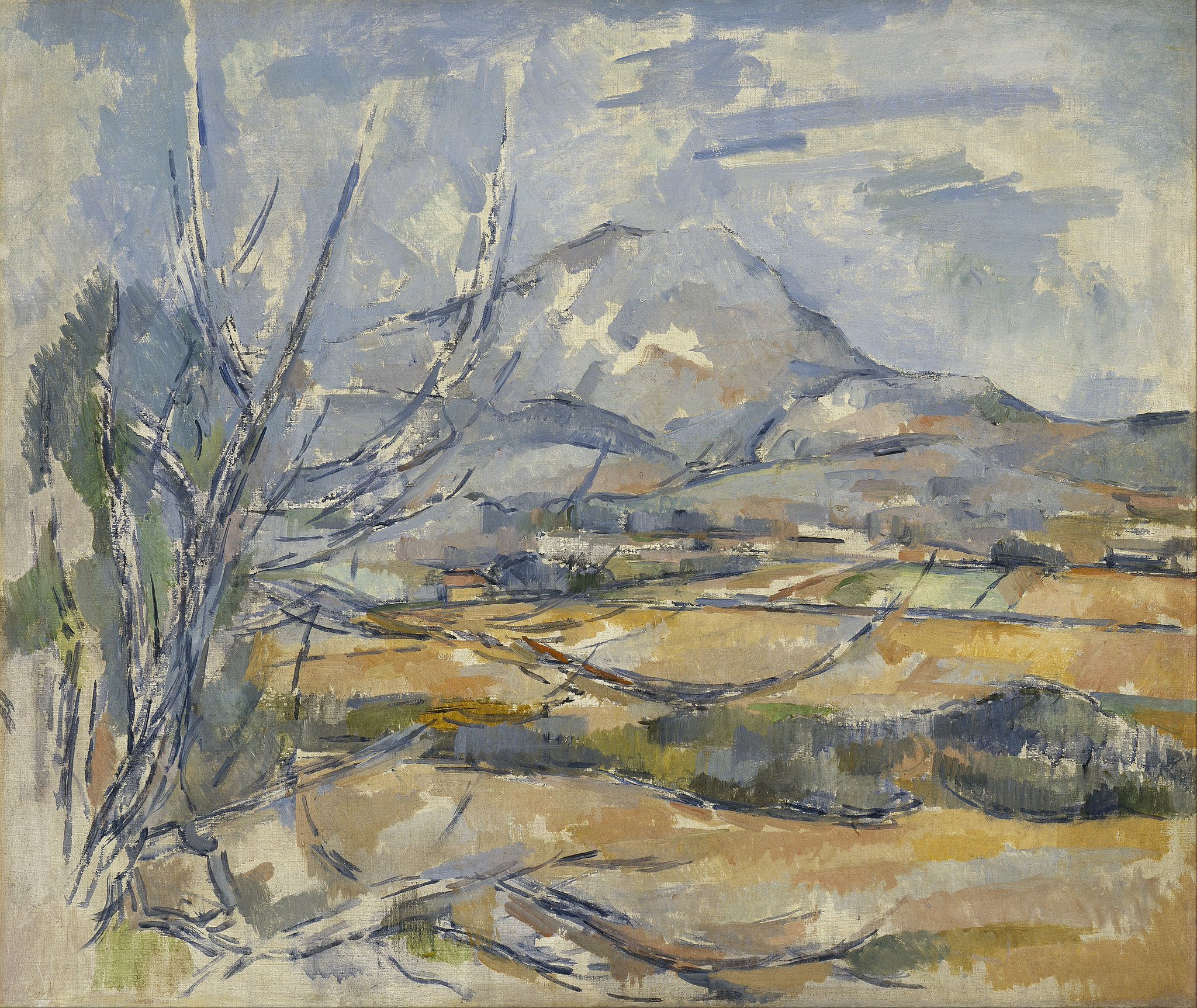
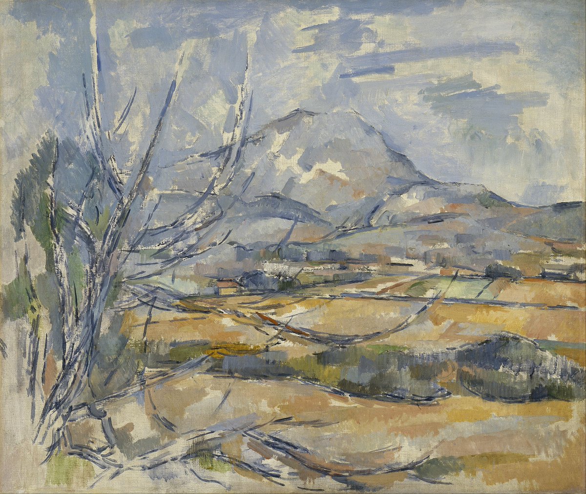
First, a little background. Montagne Sainte-Victoire is a stretch of mountains in Southern France. You mostly hear about it because of Paul Cézanne's paintings from 1904 to 1906. 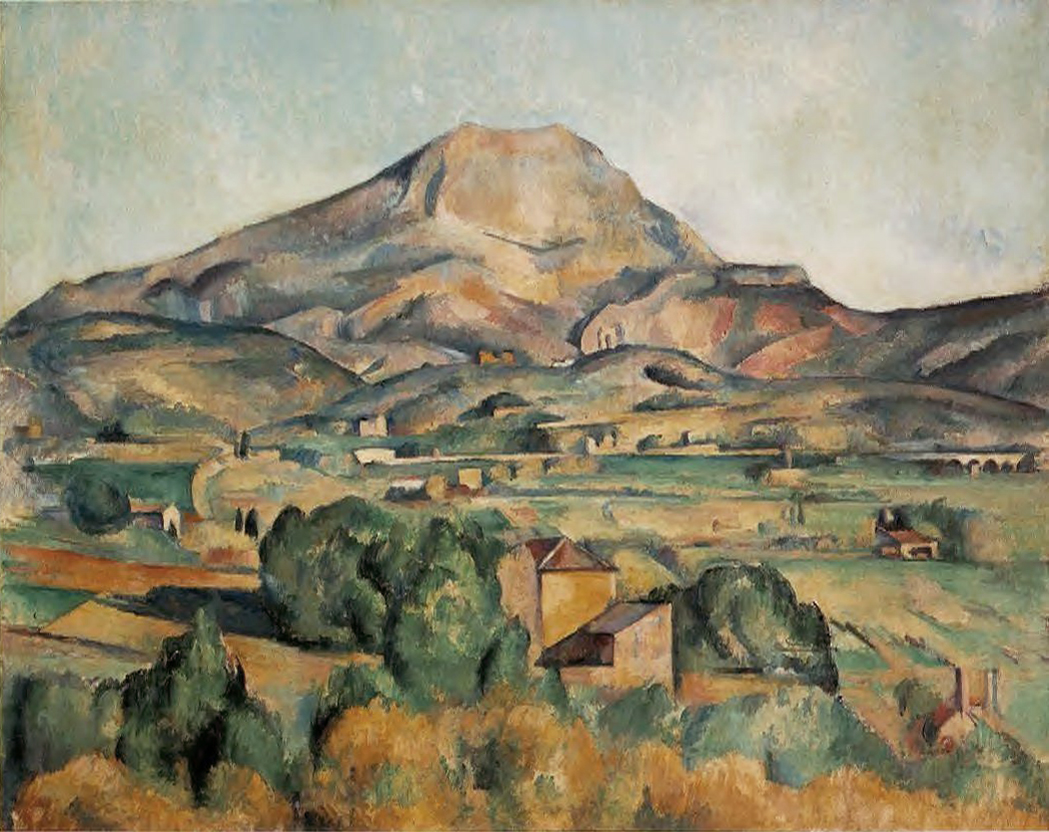


But Picasso also lived there, and it's where he's buried. When he moved in, he told his agent he had bought a Sainte-Victoire. His agent, thinking Picasso had bought one of Cézanne's paintings, asked which one, to which Picasso responded, "La vraie" ‒ the real one. 

Vera Molnár also had an ongoing relationship with the mountain. She ran into Cézanne's paintings as a student in Budapest, forgot about them, then ran into the mountain again decades later. Over time she made something like a dozen pieces depicting it. 

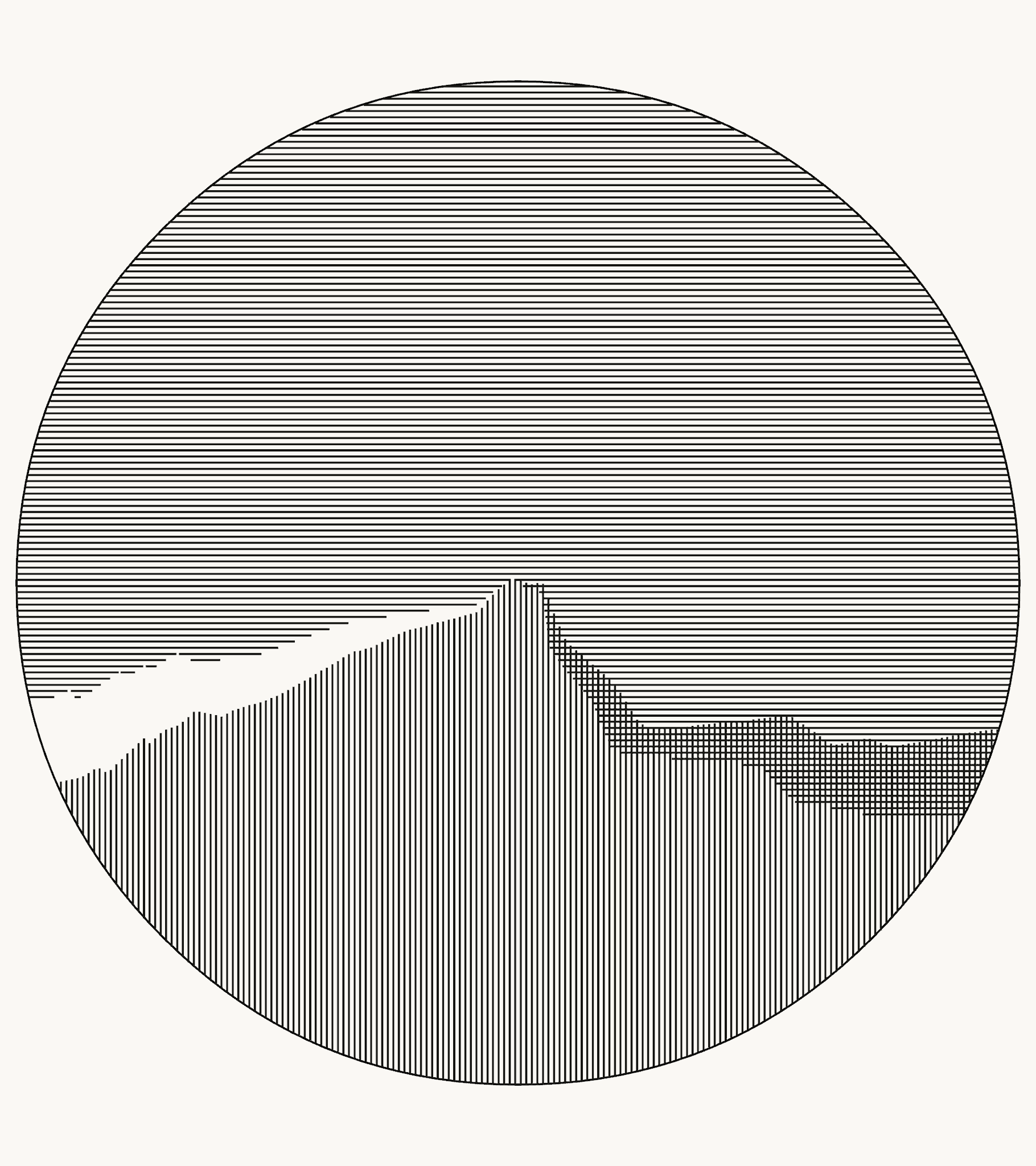
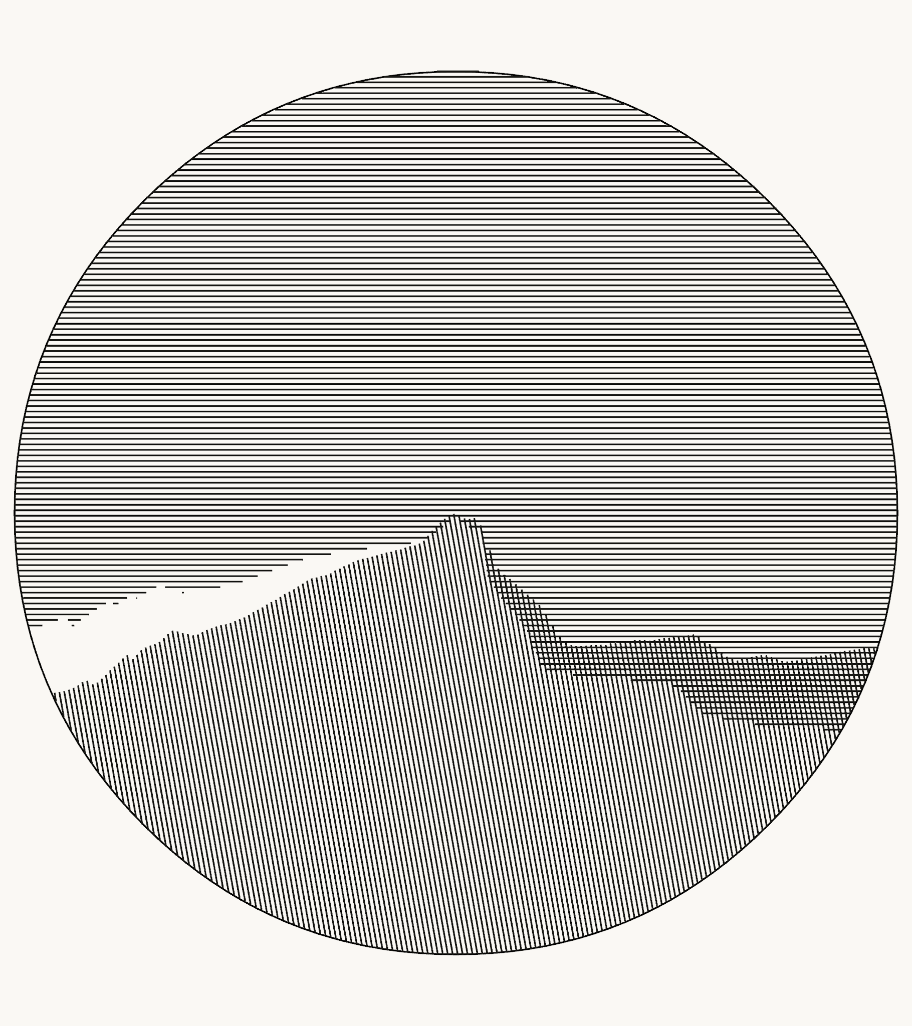
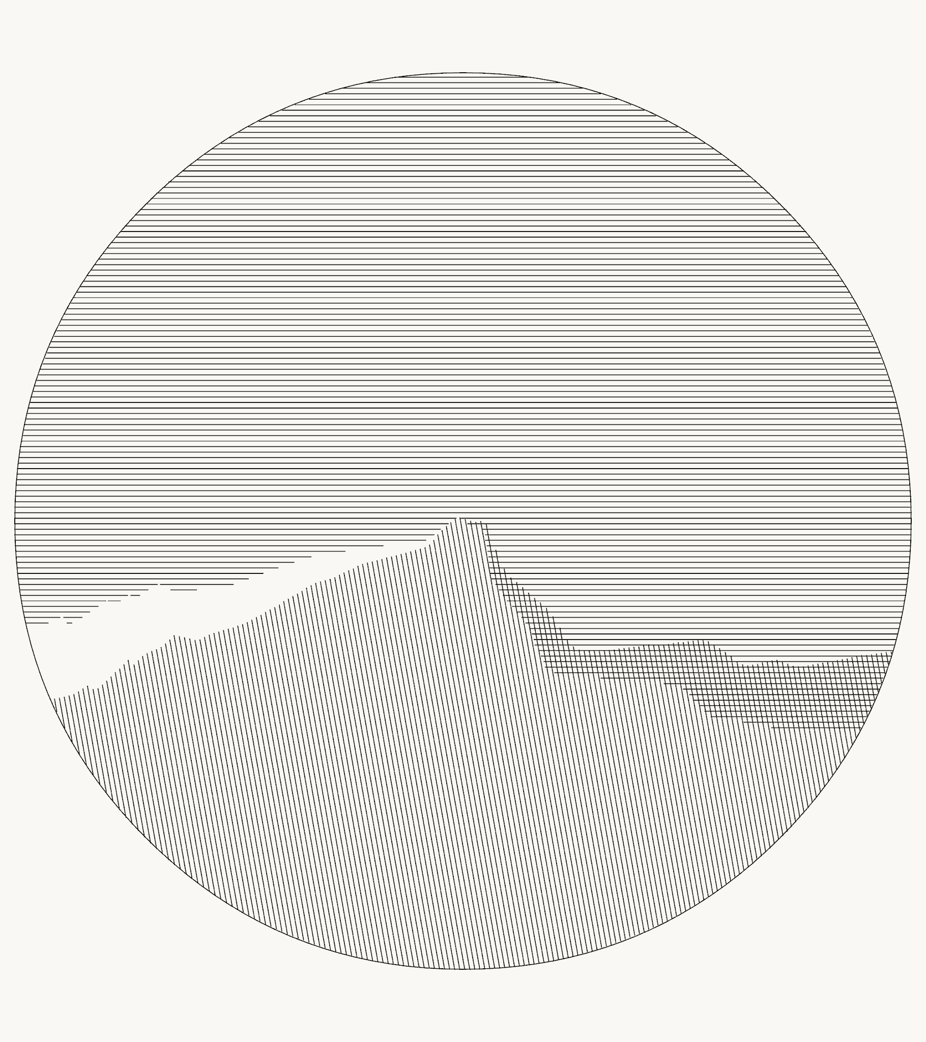
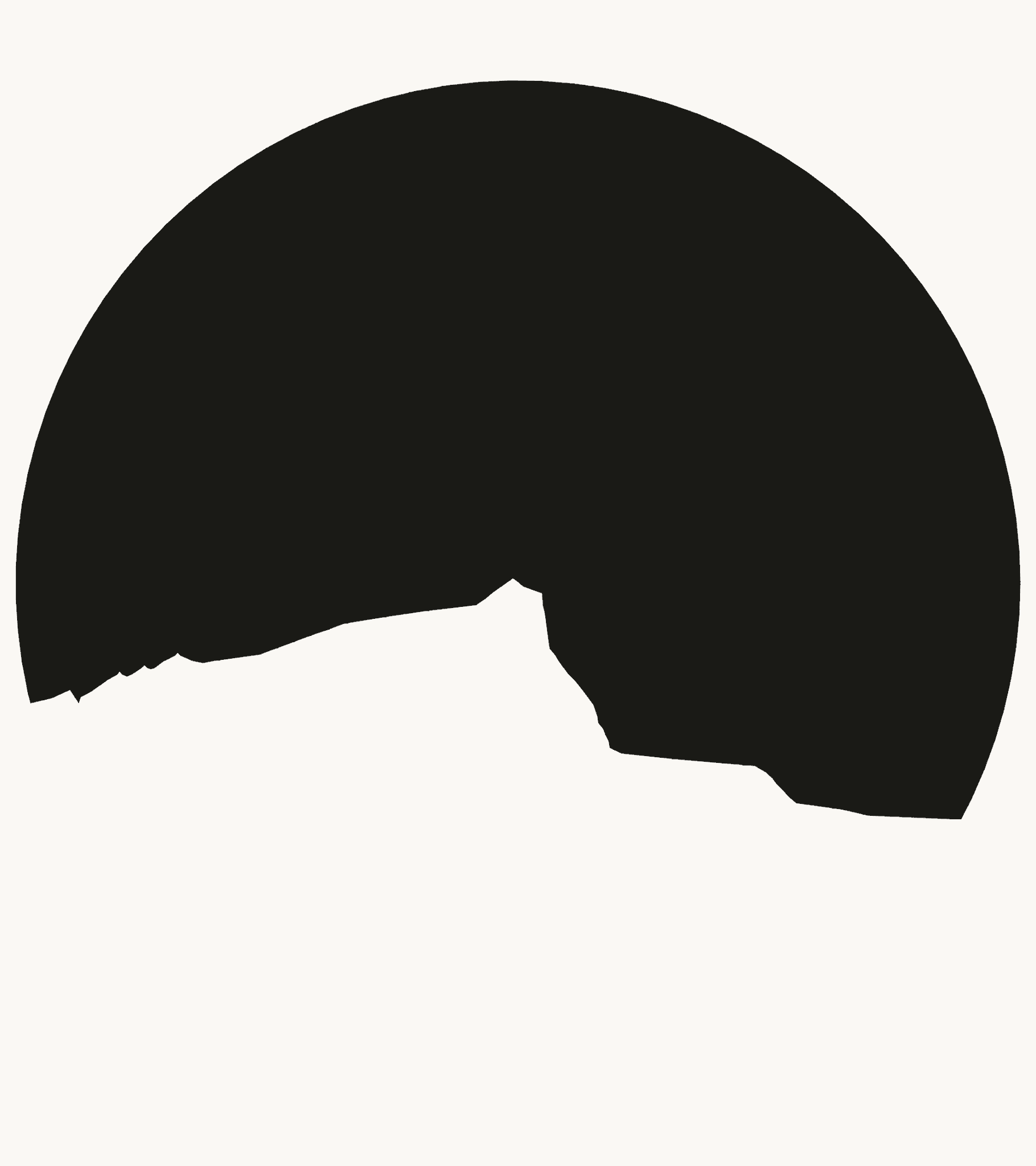
For "Sainte-Victoire en rond", Molnár creates three different values ‒ light, medium, and dark ‒ with just two sets of straight lines. And she uses those values to create the full three dimensional illusion of the mountain.
But the true brilliance of the piece becomes obvious when you get the details slightly wrong.
Here's what it looks like if you draw the bottom hatches vertically instead of at a slight angle. You completely lose the sense of shadow and slope.
(Original on the left.)
Here's what it looks like if you draw the bottom hatches vertically instead of at a slight angle. You completely lose the sense of shadow and slope.
(Original on the left.)


And here's what happens if the lines overlap too much at the peak ‒ they no longer look like the shadow cast by the mountain. 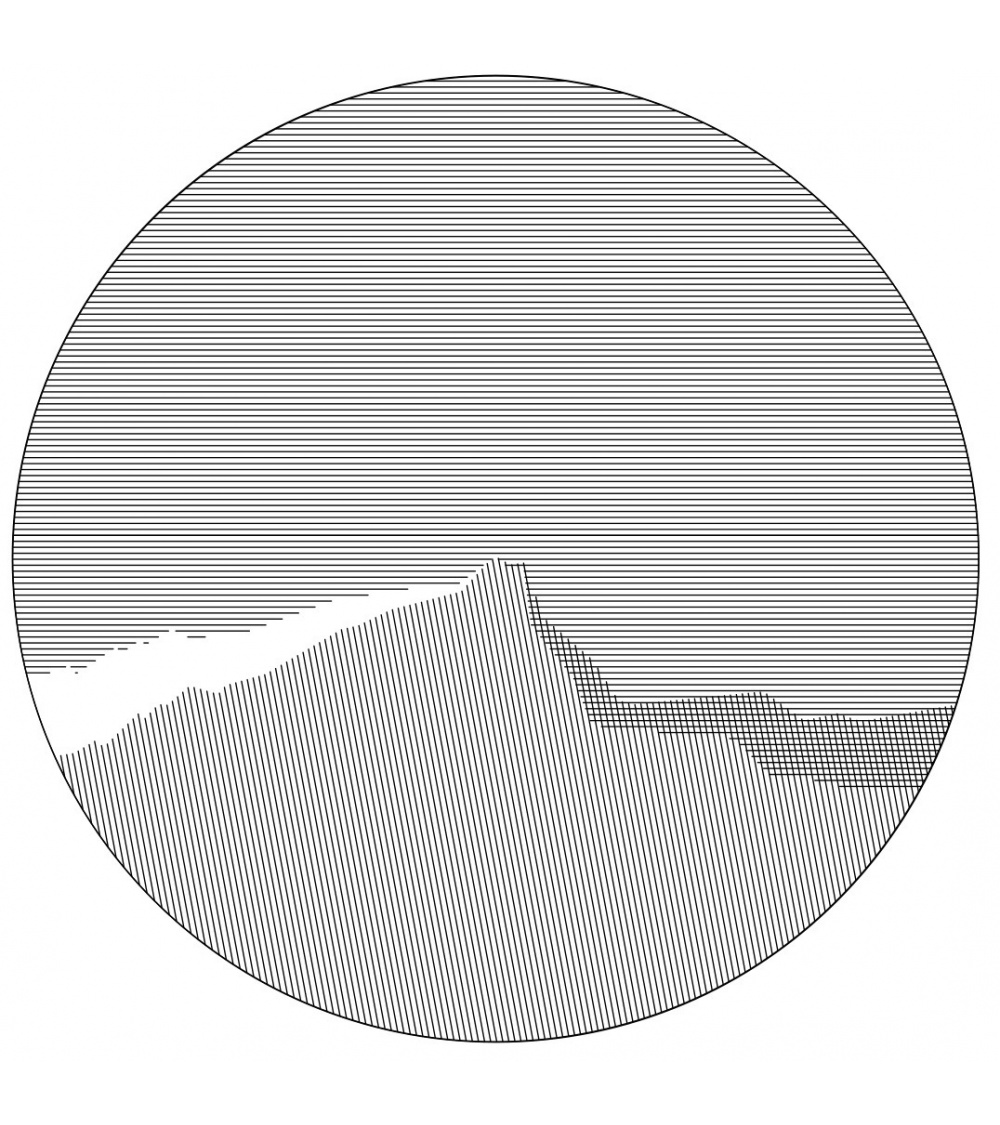


And here's with the lines just a touch too thin. This reduces the contrast overall, making the piece feel less striking. 


But when you get them all just right? The difference is immediately noticeable. Here's my finished piece next to Vera's original. 


Oh, and a little bit about my process ‒ to get the curves of the mountain into my code I traced them using @figmadesign, then exported and parsed the resulting svg. 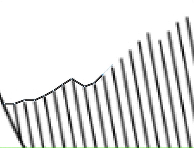

Figma was also great for taking measurements of the original piece so I could get the placement exactly right. 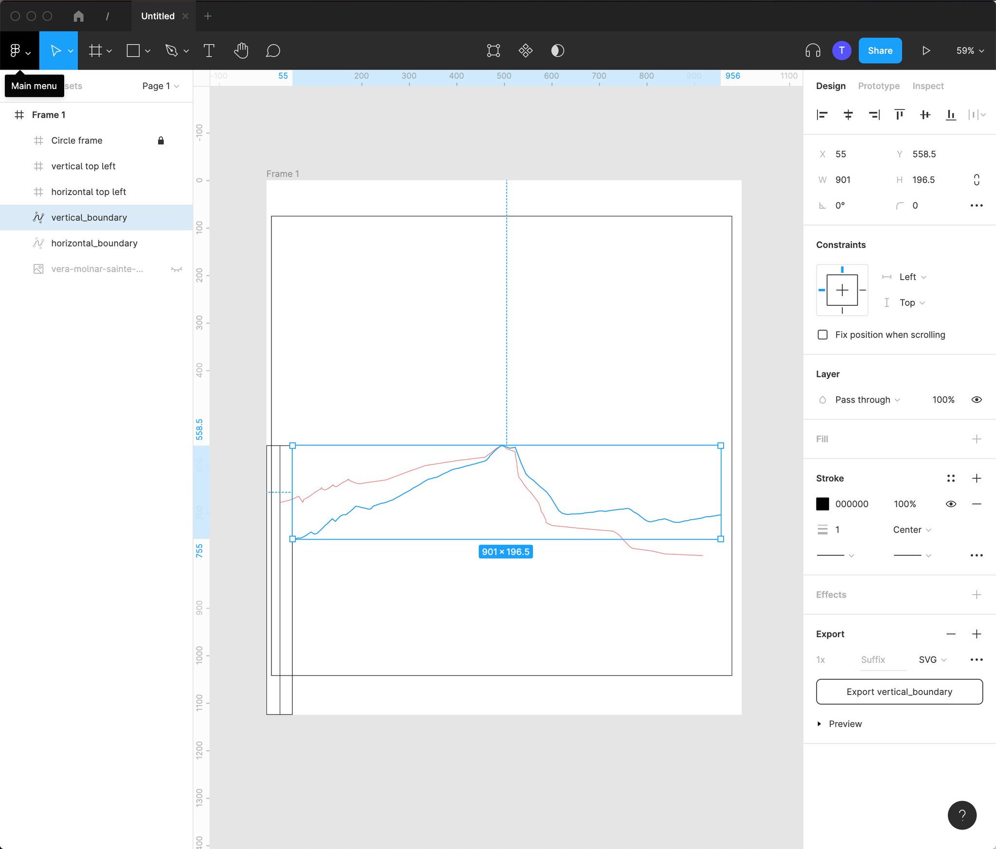

Figuring out how to draw the lines was surprisingly tough:
1. Combine the points from the parsed svg with 4 other points to form an almost-rectangle.
2. Find the union of that shape with a circle.
3. Draw horizontal lines, deleting any points that fell out of the permitted area.

1. Combine the points from the parsed svg with 4 other points to form an almost-rectangle.
2. Find the union of that shape with a circle.
3. Draw horizontal lines, deleting any points that fell out of the permitted area.


Thanks to @zachlieberman for the delightful lecture on Vera that helped me find this piece!